Watermillion Branding
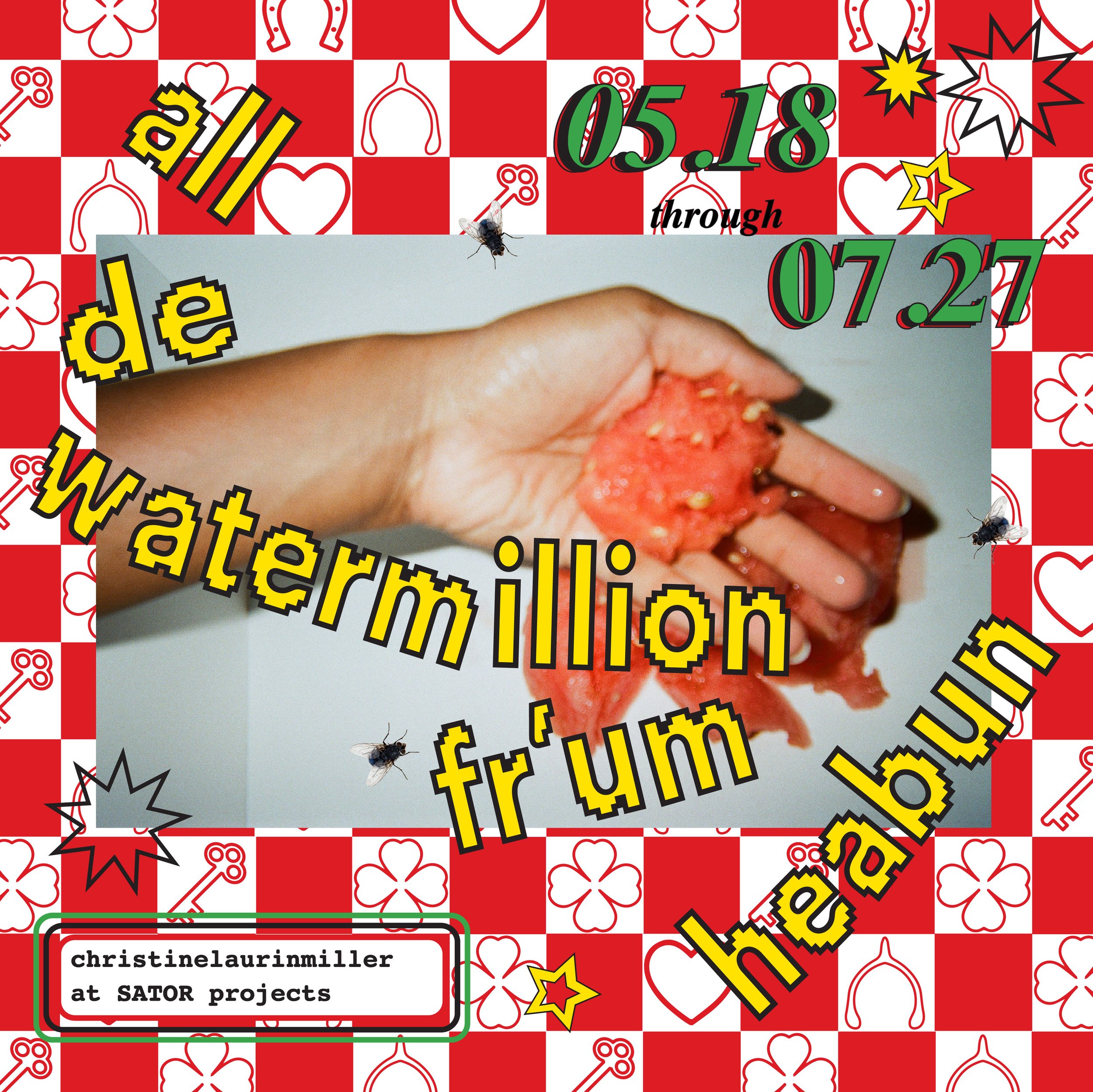
For my show all the watermillion fr’m heabun at SATOR Projects, I wanted to create a distinctive branding and visual language that felt deeply rooted in history while also being playful and contemporary. With a background in fine art, design and a self-taught journey in graphic design over the past few years, I’ve been inspired by fellow self-taught graphic designers who’ve built successful careers grounded in research and storytelling. My passion for historical graphic design by Black designers significantly influenced this project.
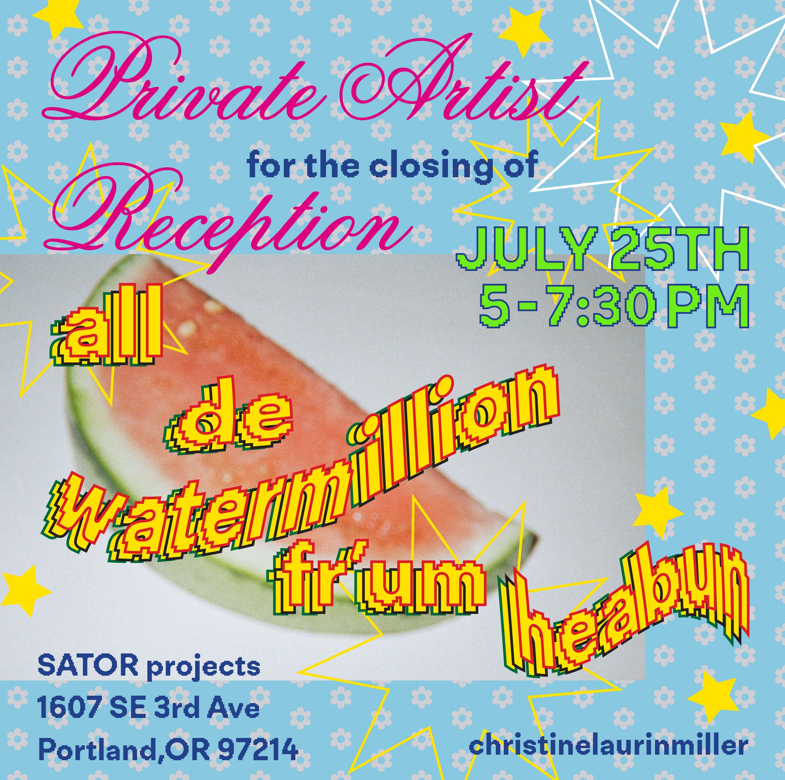
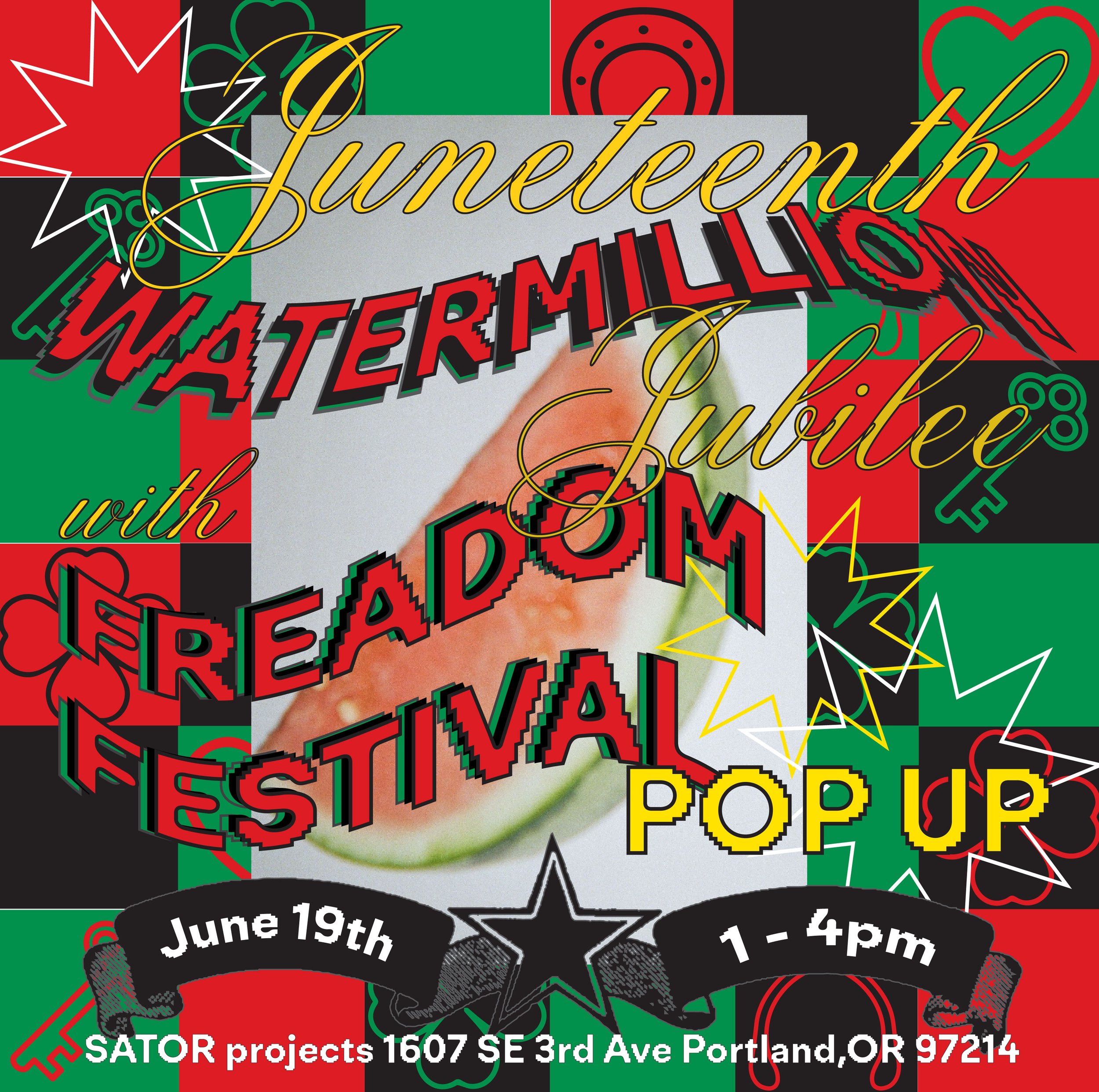
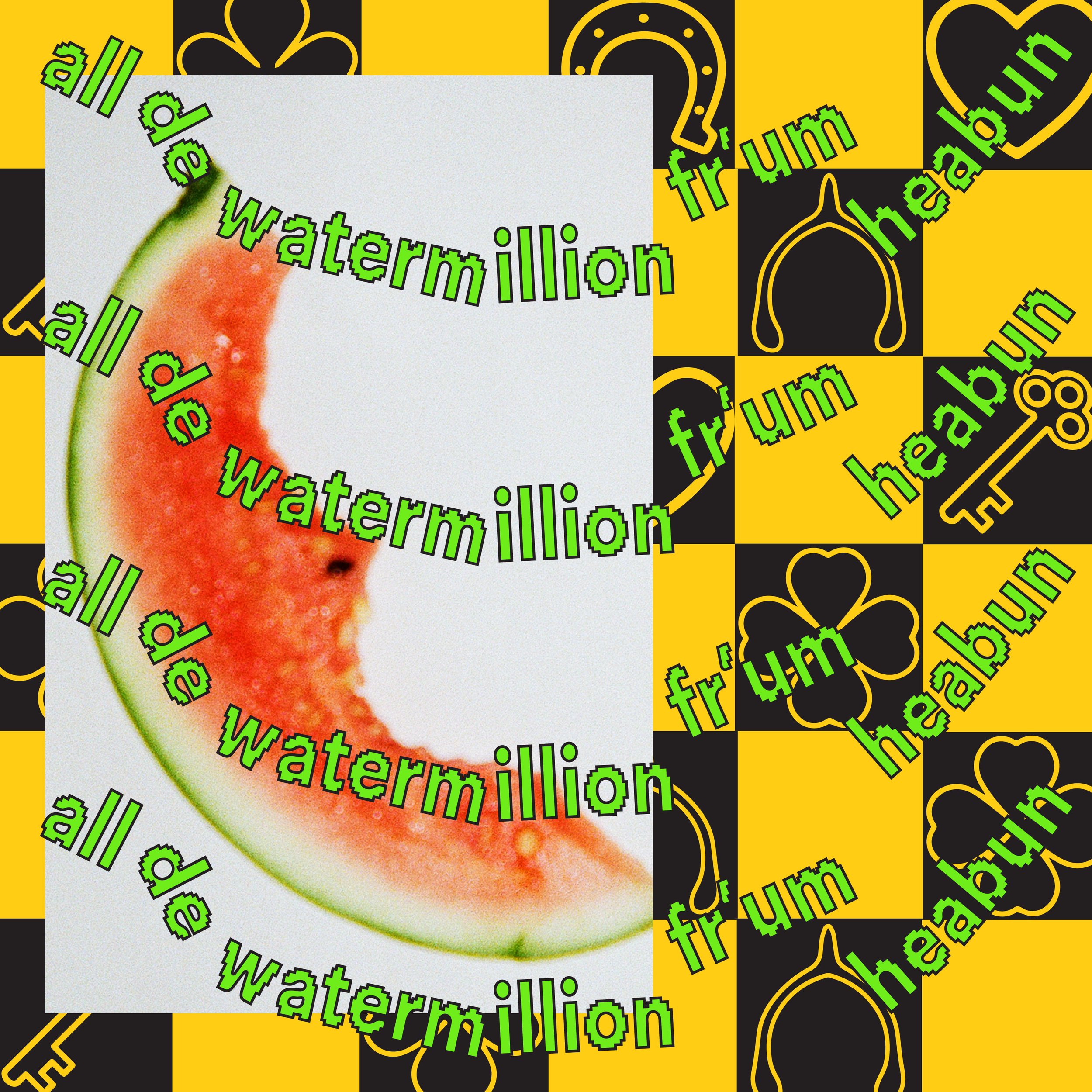
For this show, my inspiration came from my personal collection of vintage items, specifically from a 1930s Lucky Brown pressing oil tin designed by Charles Dawson – a Black designer based out of Chicago. I recreated its nontraditional checkerboard motif in Illustrator, using it to evoke an Americana aesthetic that perfectly aligned with my vision for the show’s branding.
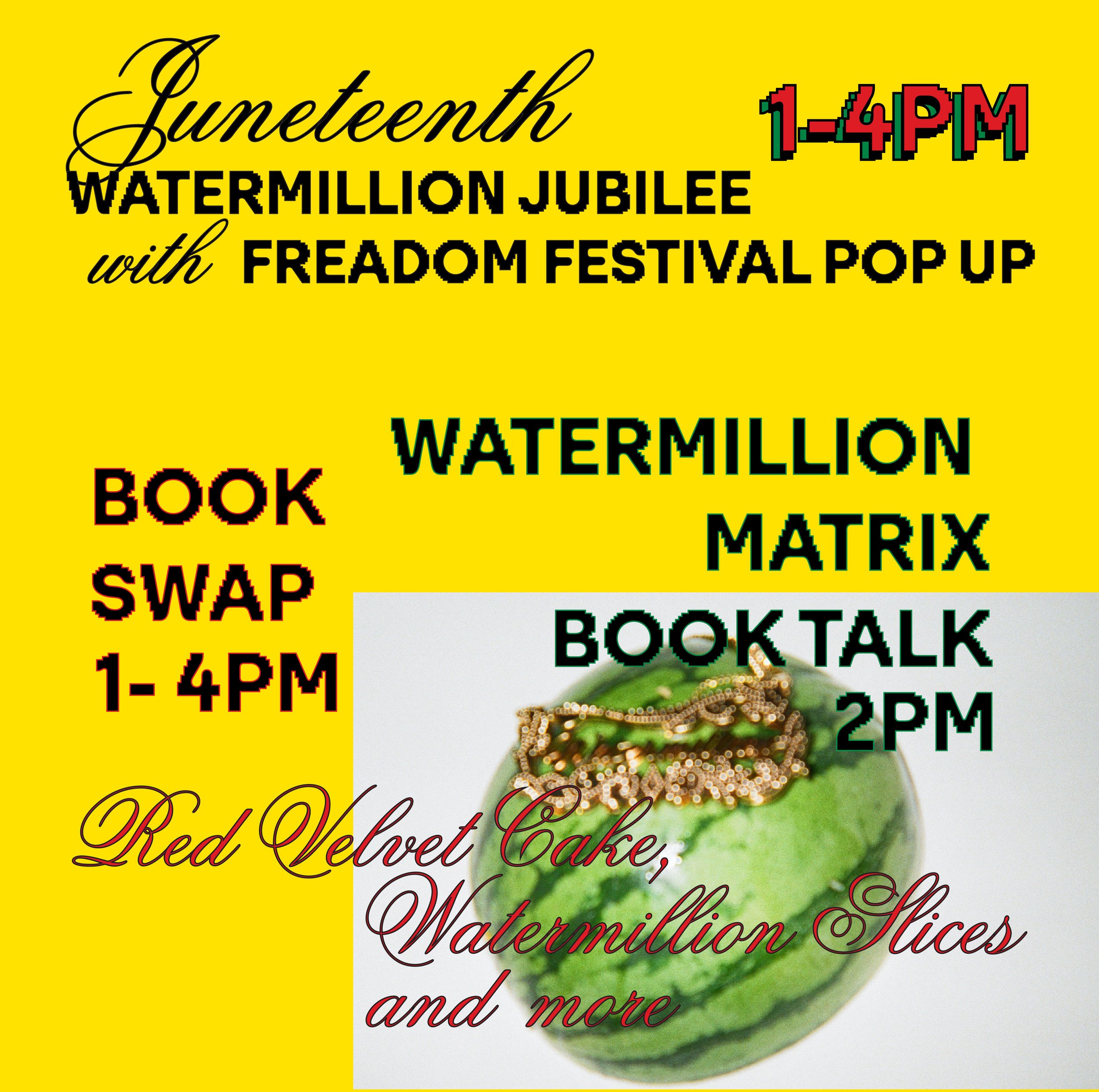
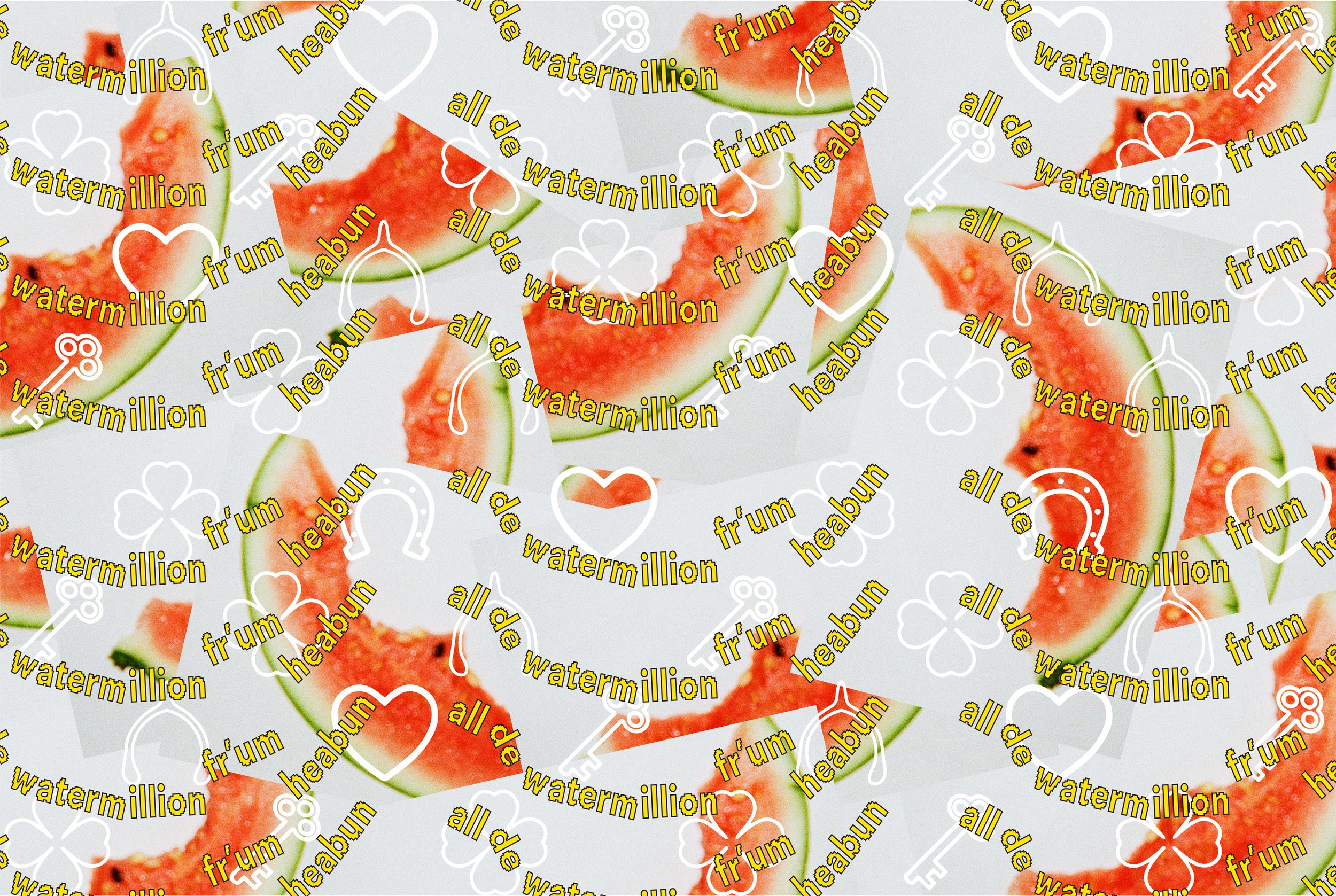
A key attribute of my graphic design style is incorporating physical, tactile objects into my work. For this project, I took photographs of watermelons with a disposable camera and seamlessly integrated them with the typography to create a cohesive and textured design. The intention and result was a marketing aesthetic that felt raw, vintage yet futuristic, kitschy, and playful. These graphics were utilized across social media and email campaigns, tying together the show’s themes with a cohesive and striking visual identity.

